Krava
3 days
Venture-backed startup, where I designed UX+UI for a mobile-friendly early access program for an upcoming ADU company. Goal was to intrigue, inform, and showcase the use cases of their product. Leading to 500+ early adopter signups
Venture-backed startup, where I designed UX+UI for a mobile-friendly early access program for an upcoming ADU company. Goal was to intrigue, inform, and showcase the use cases of their product. Leading to 500+ early adopter signups.
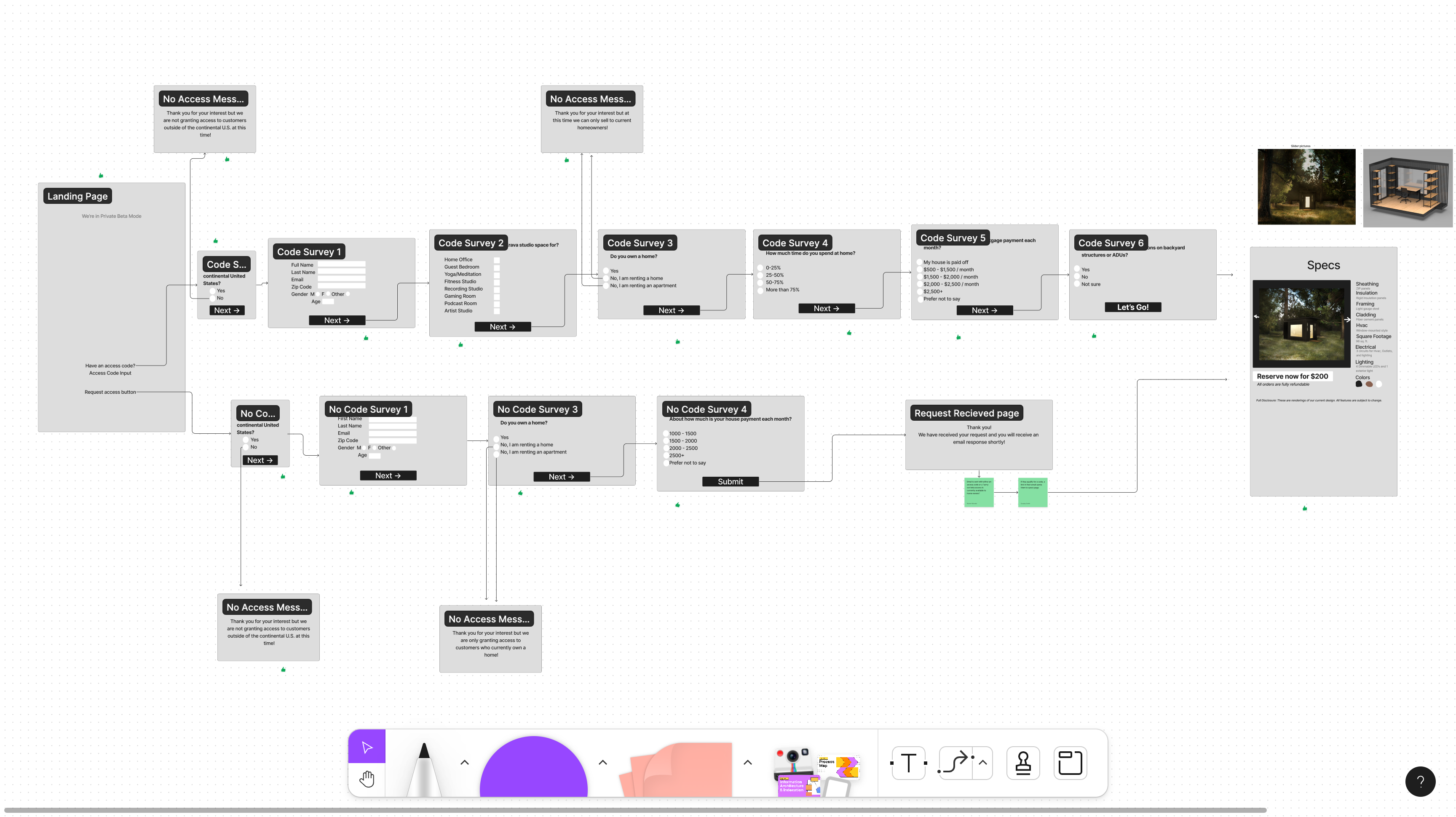
Kickoff Workshop
This hour-long workshop was a quick way to get caught up to speed, collect relevant data about the flow and align on expectations.
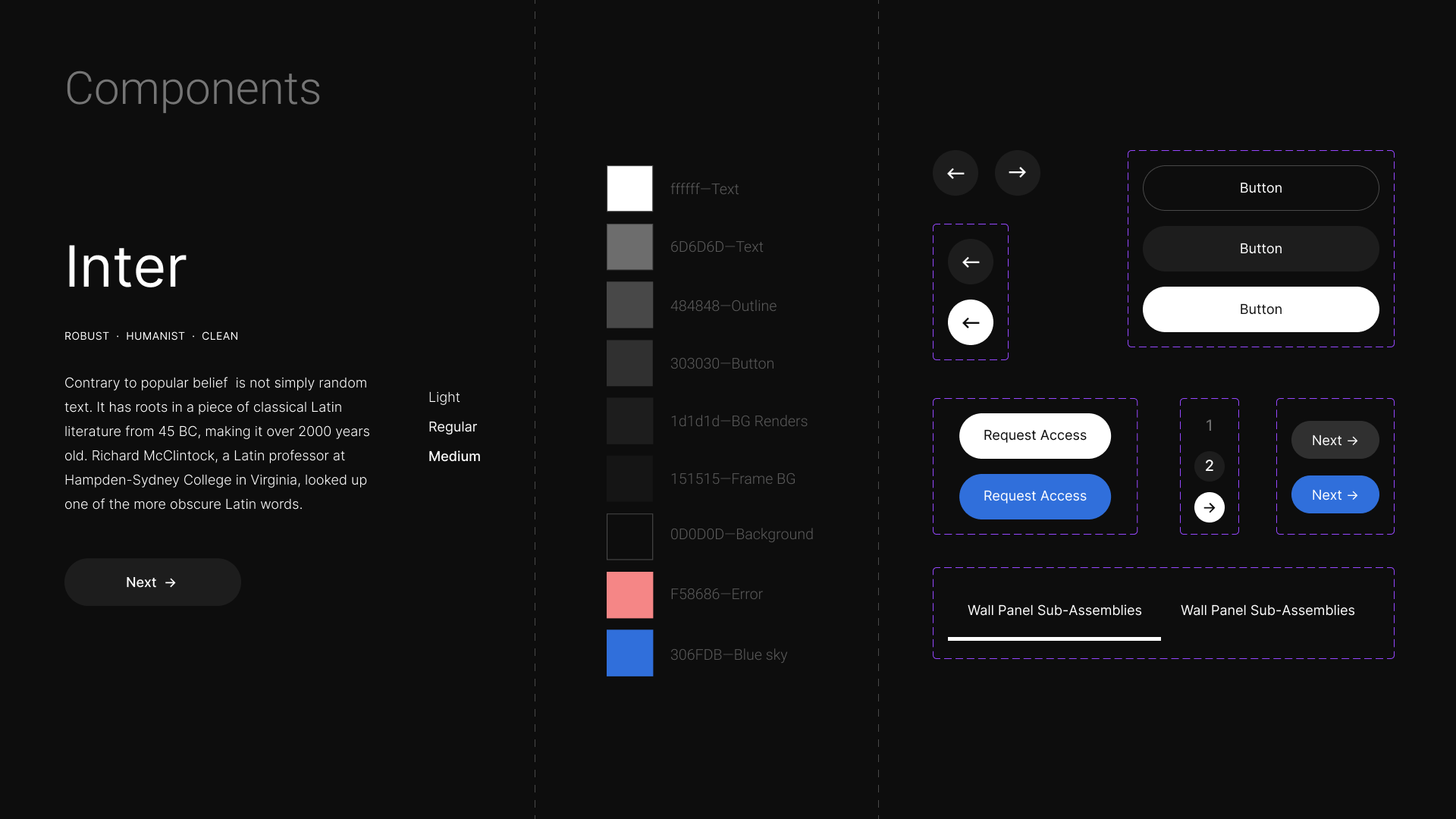
Mobile First Card Design
I created a minimalistic adaptable card component that promotes a content-centric approach, focusing on delivering meaningful and concise information to users across devices.
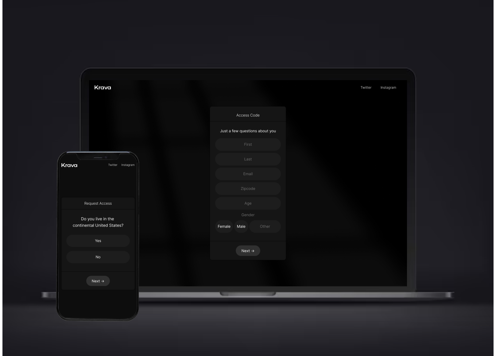
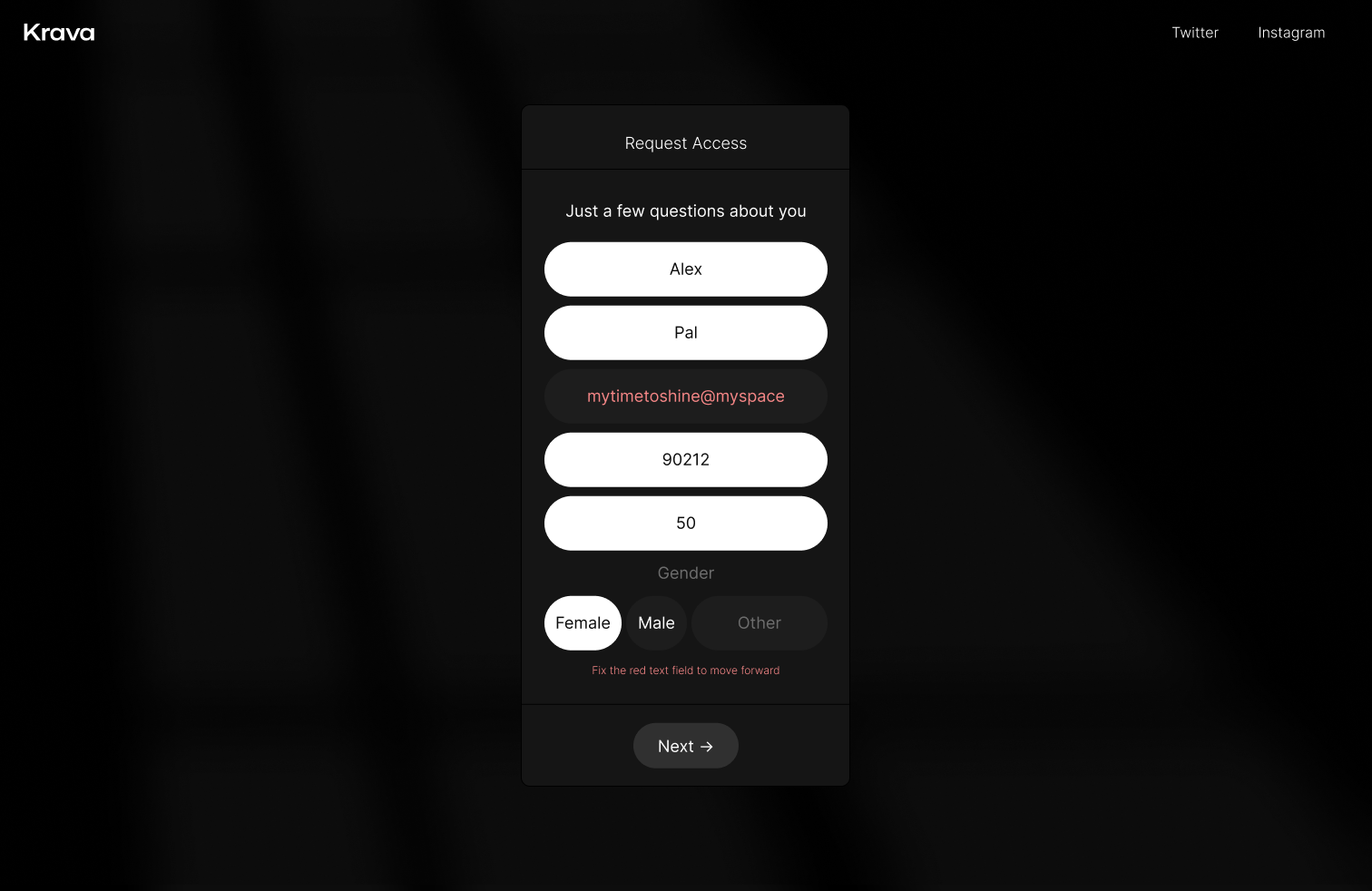
Understanding the Error
Perceivability is essential with accessibility design. Error messages should be presented in a clear and noticeable way, using appropriate contrast, size, and placement to draw the user's attention.
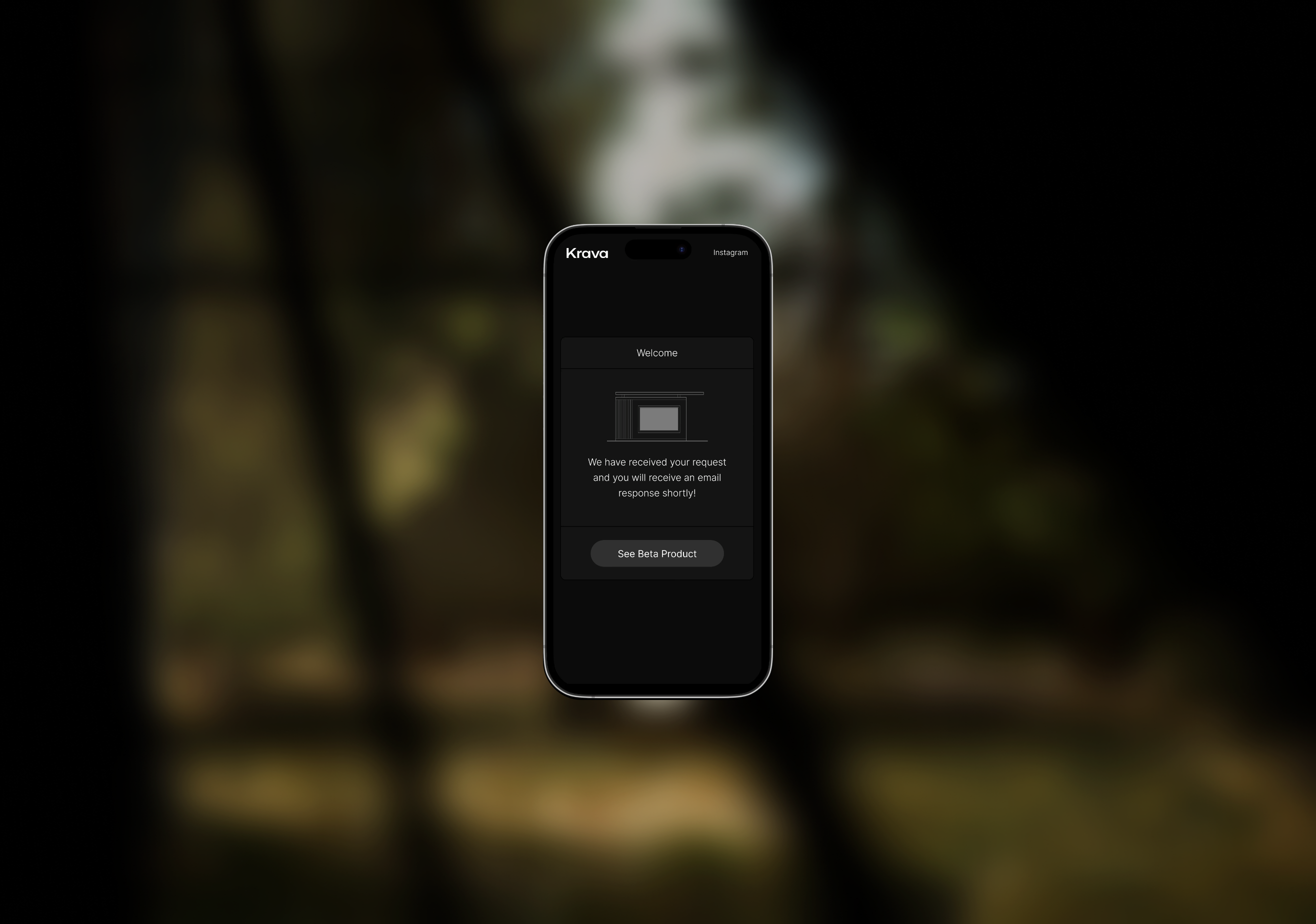
Promotable Tweet
Growth idea to capture the early adopters that are interested but not yet approved. Great opportunity to stay engaged and are willing to spread the word by sending a short tweet.
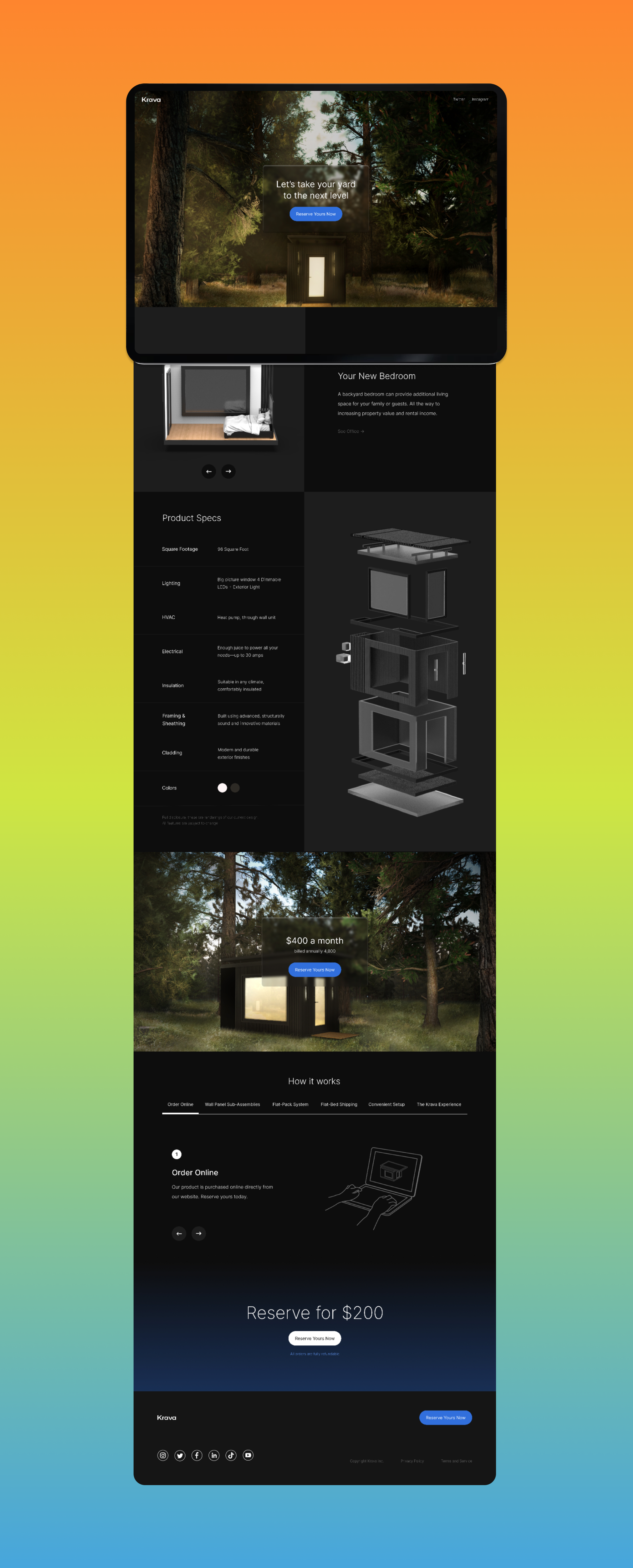
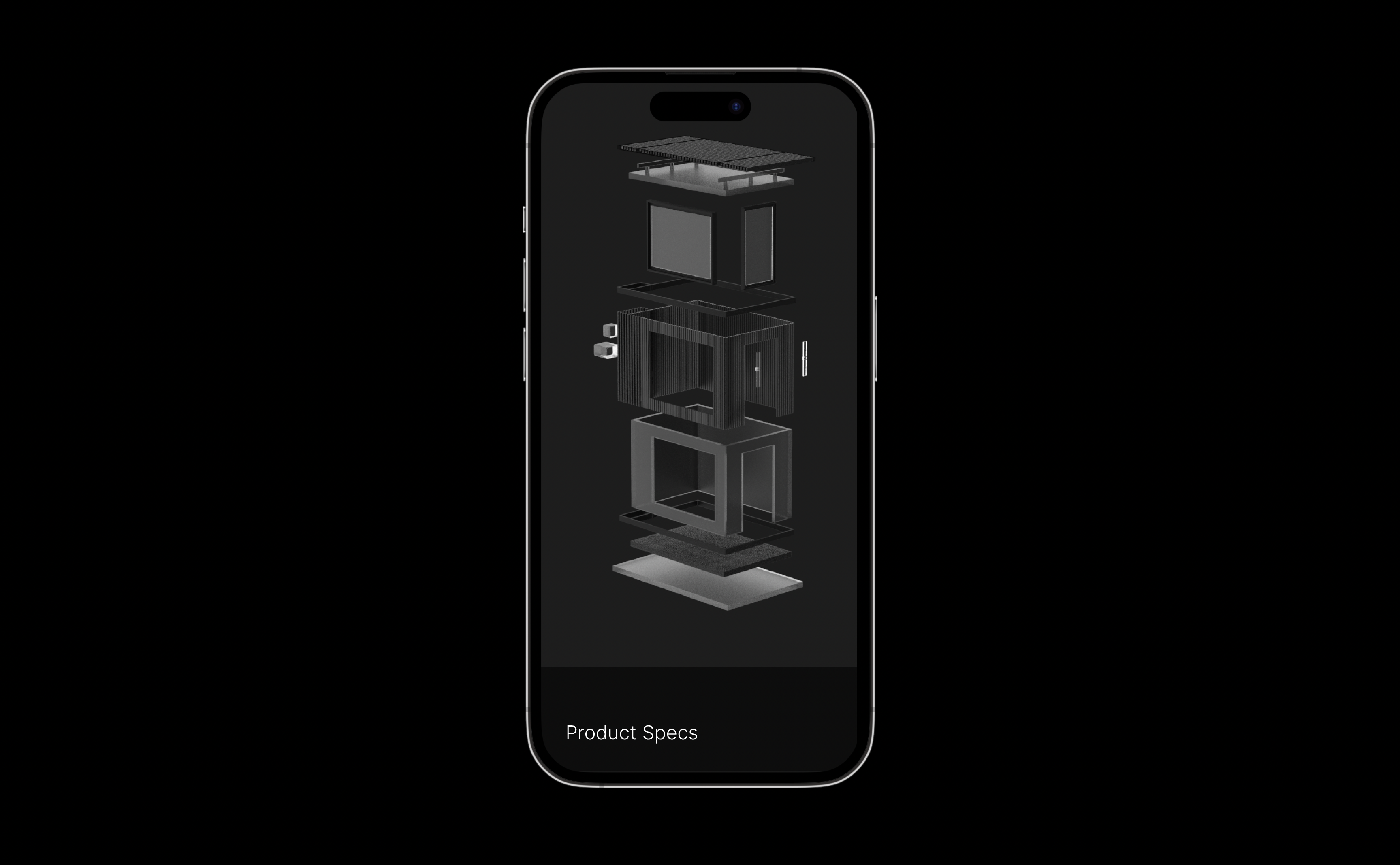
Product specs for multiple use cases
The goal was to showcase the multiple use cases of the unit in their backyard ranging from a recording studio for a podcast to an extra bedroom for an inlaw.
We chose to write-out the product specs accompanied with an exploded view of the product was a collaboration between me and their in-house product designer.
Takeaways
Having a mid-project check-in to review the core components of the system guaranteed the expected results at the end.
Having a mid-project check-in to review the core components of the system guaranteed the expected results at the end.
